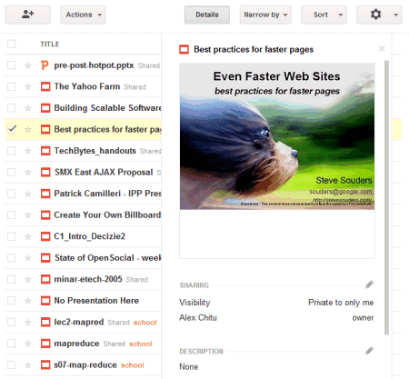
Another change is that the details pane is no longer a sidebar. If you want to find more information about a document, select it and click "Details". Google Docs will display an overlay that includes a large thumbnail, sharing information, the list of collections where you placed the document and some other information.
There's also a button for sharing the selected documents and some new icons for documents, spreadsheets, drawings, presentation and other files.
{ Thanks, Tom. }

Thhey should add this option also to all the other Google products.
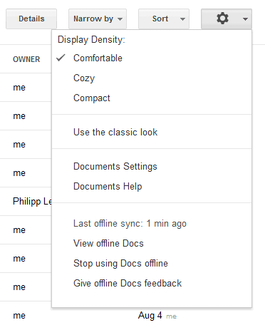
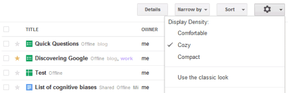
ReplyDeleteI like the transition from each setting. I'm going to leave it in Comfortable, but it looks like the sweet spot is Cozy.
ReplyDeleteI like the new Google look, though it is a lot (much too) whiteness abound.
It also shrinks the gray Google search bar below the black profile bar at the top, which is great. That bar is too tall, and I hope this feature comes to the other products, too.
ReplyDeleteI'm with Todor and Anonymous. This feature is desperately needed on Gmail, at least. Also, multiple inboxes with the new layout looks atrocious.
ReplyDeleteLooks nice. I got it set to cozy at the minute.
ReplyDeleteI think they could have design the preview pane better, a nice right click be nice, or something on each file you can select to preview a document.
The new share and options buttons are doubling older functionality. Im seeing less cohesion in docs and other services. I don't know is this management problem or project but some one just could do something.
ReplyDeleteThey should still focus on 'easy and confortable' to use instead of just 'design'.
ReplyDeleteGoogle please add more sorting options (sort by title up/down, sort by date created and so on...).
ReplyDeleteThis sorting options are just basic ...
They should reduce the buttons' size on the top as well. On the small screens some buttons move to the second line and thus are not visible.
ReplyDeleteAlso top panels and buttons inside documents/spreadsheets etc. should be reduced. Not only in Documents main page.
ReplyDeleteYeah, needing this on all Google products. Since the design change I'm having a really hard time on my netbook display.
ReplyDeleteSuperb...Simply the best
ReplyDeleteI second David Knowles. Also, I'd like to lock preview pane as a default view. The checkbox to select a file is nearly invisible. Why does this new interface have to be so warm, light and fuzzy as opposed to sharp edged and clear? Stop being so cutesy pretty, Google.
ReplyDeleteI think the most important that Google can focus to improve the useful of the site rather than the web design.
ReplyDeletehi eyelash,
ReplyDeletethis Google docs is useful but it rather need some add up functionality like what Scribdd , Docstoc did...
but i disagree with you, web design is still needed here... it make the program looks professional and trust able :-)
As usual, Google Apps users have to wait at the back of the line!
ReplyDeleteWhen I change the Display Density, nothing happens, even though the new option is checked, until I reopen Docs, when the display returns to Compact. What is wrong, please?
ReplyDeleteDitto on that when I change the setting nothing happens. Also, when I do change it and refresh, it always goes back to "Compact", and IMHO "Compact" isn't very compact.
ReplyDelete